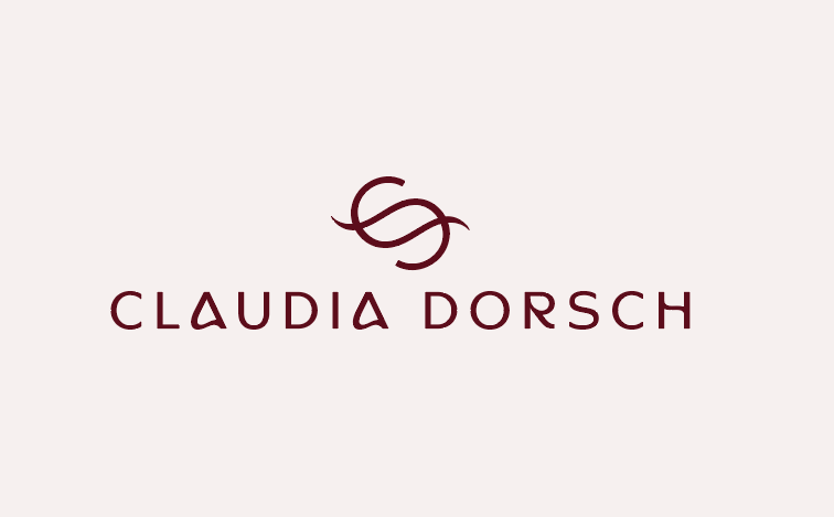
Claudia Dorsch| 2026
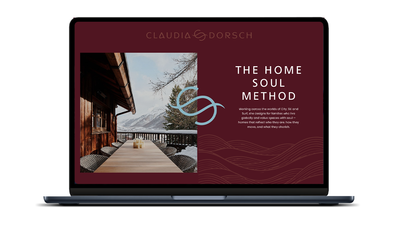
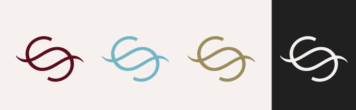
Claudia Dorsch creates homes shaped by culture, landscape and the rhythms of everyday life. The rebrand was developed to reflect this balance between architectural precision and emotional connection. At the heart of the identity is a bespoke monogram formed from two interwoven letterforms. The mark symbolises connection, movement and the dialogue between people and place that sits at the centre of Claudia’s work.
This project was in collab with TheDoers.
Deliverables
• Brand Design
• Asset Design
• Site Design

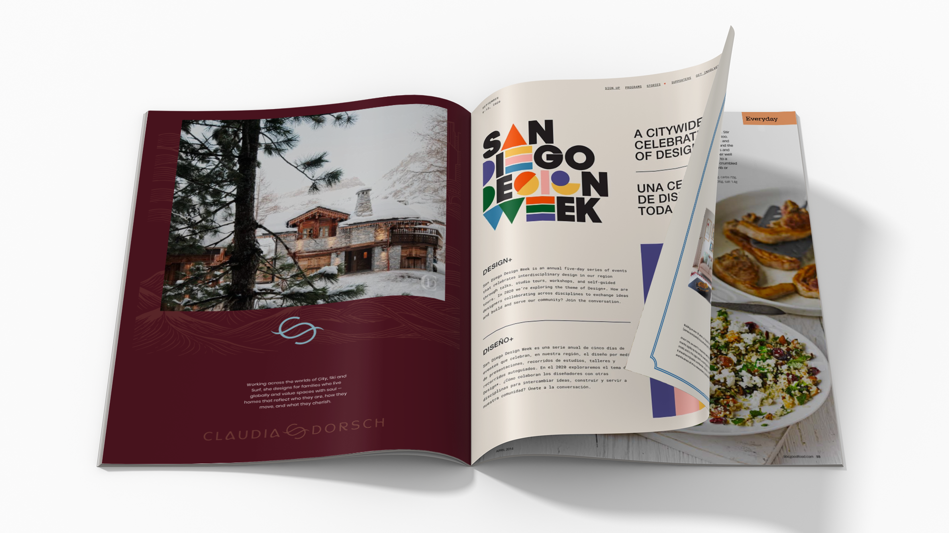
The wider visual language draws from three recurring influences found throughout her projects. A cityscape represents architectural structure and urban sophistication. Mountain forms reference landscape, permanence and a strong sense of place. Flowing lines inspired by water introduce softness, movement and the human experience of living within a space.
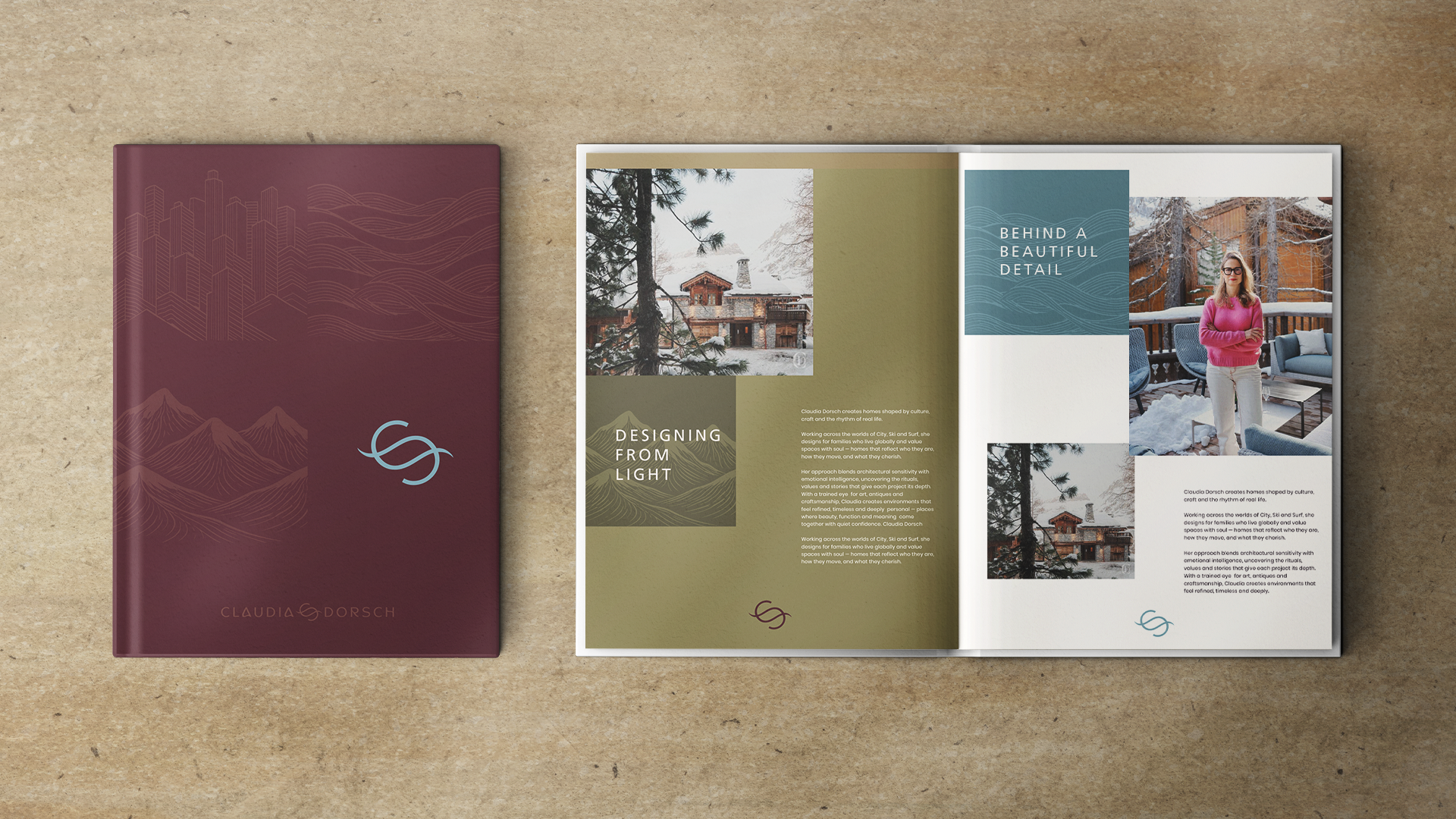
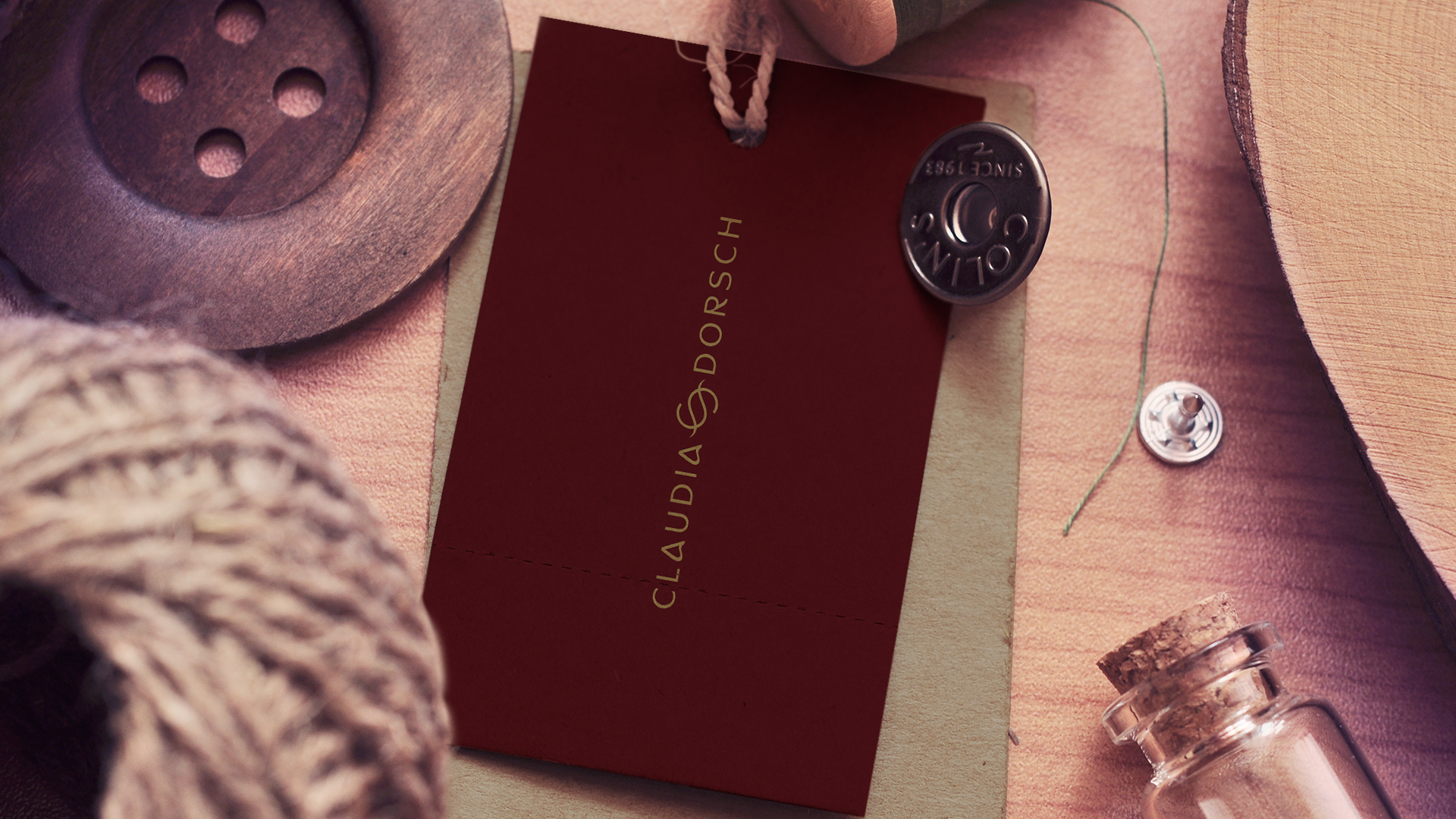


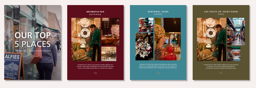
A refined colour palette combines rich burgundy with muted natural tones and soft blue accents, creating a balance of warmth, elegance and contemporary luxury. The typography complements this approach, blending clarity and sophistication with subtle character.
The resulting identity feels considered, timeless and distinctive, capturing Claudia’s ability to create environments that are both beautifully designed and deeply personal.