Policy Bee Rebrand| 2026
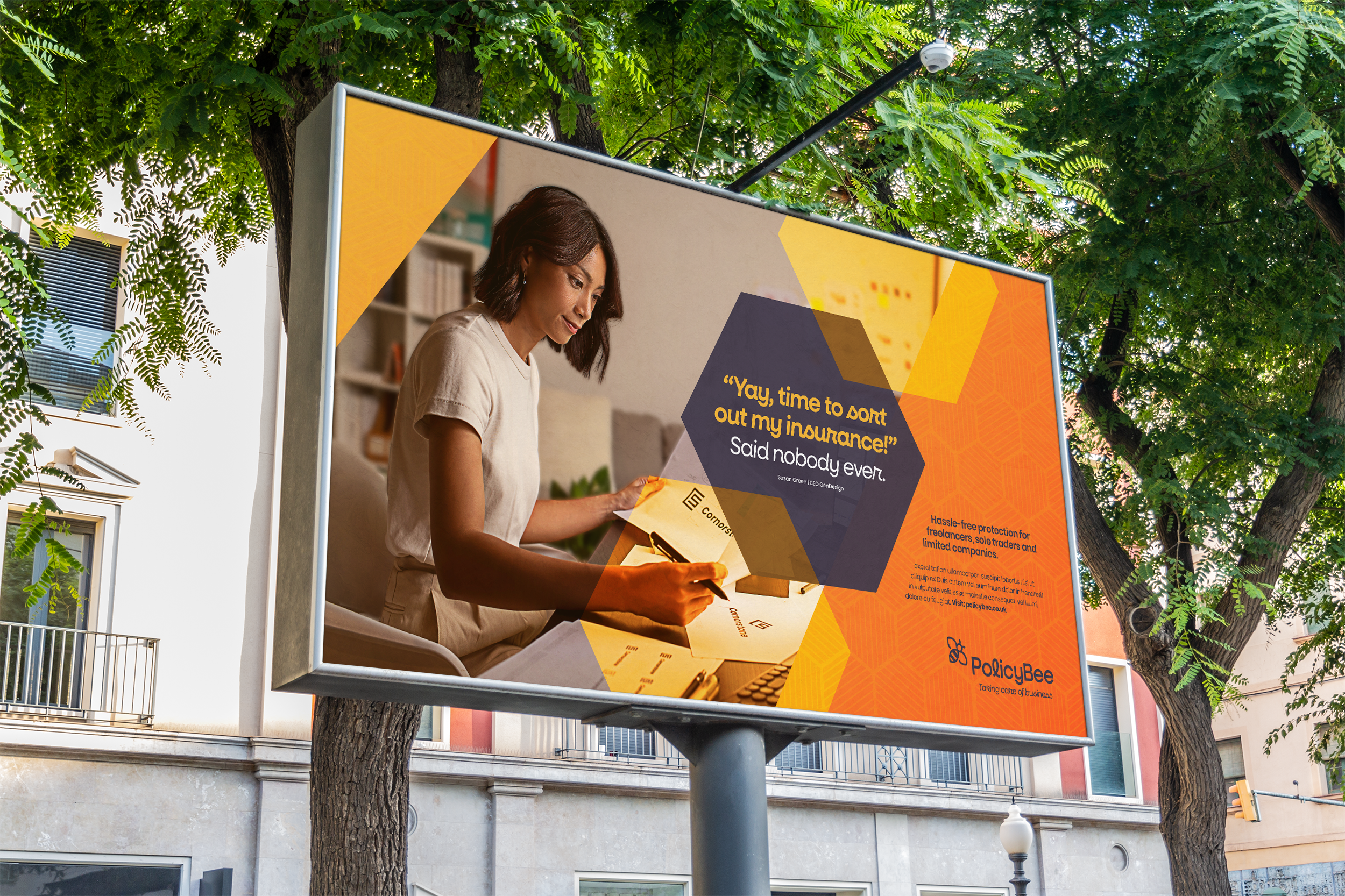
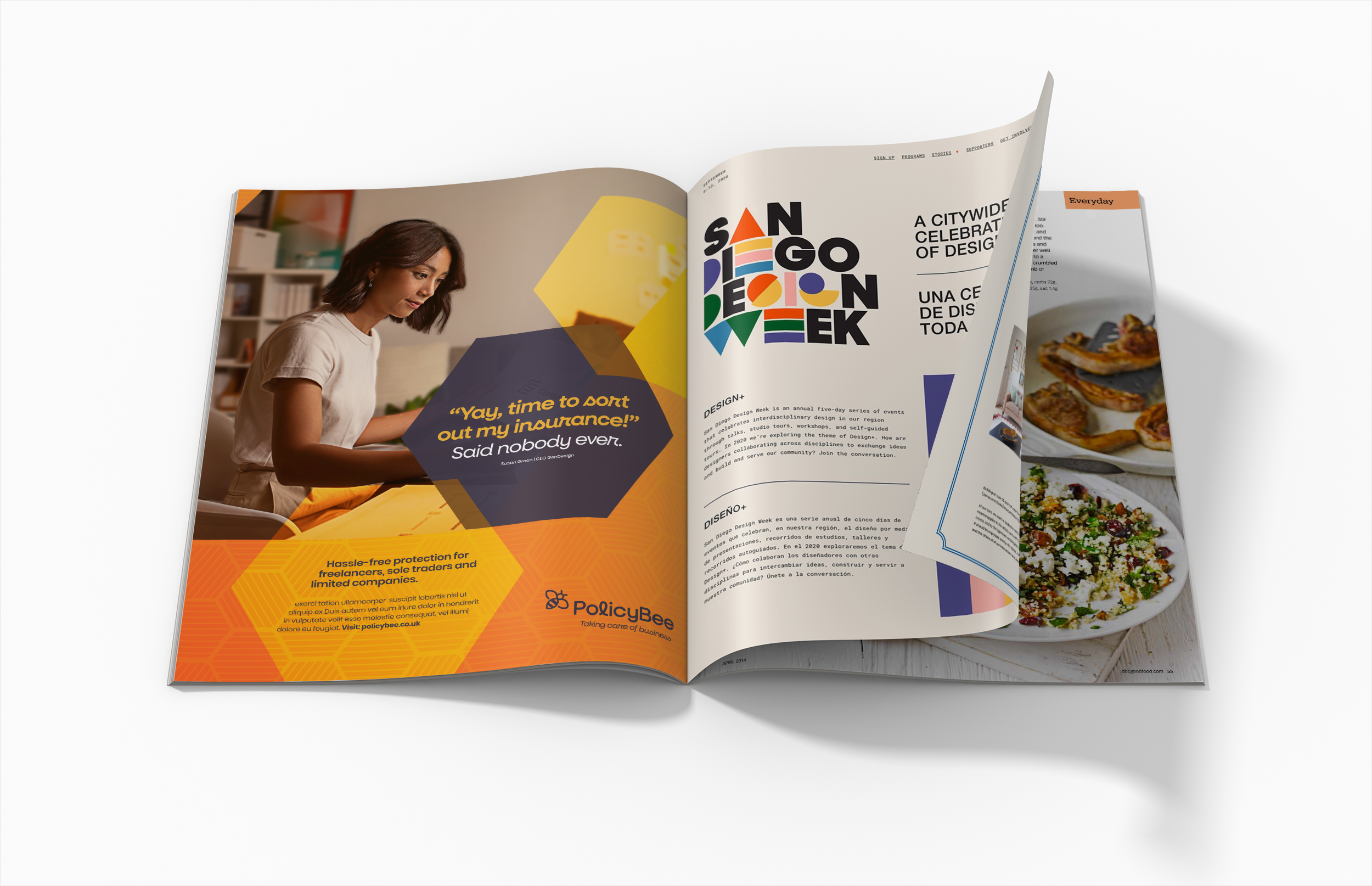
PolicyBee exists to make business insurance feel simpler, friendlier and far less intimidating. The rebrand was developed to move away from the complexity and corporate language often associated with the insurance sector, creating an identity that feels approachable, optimistic and easy to engage with.
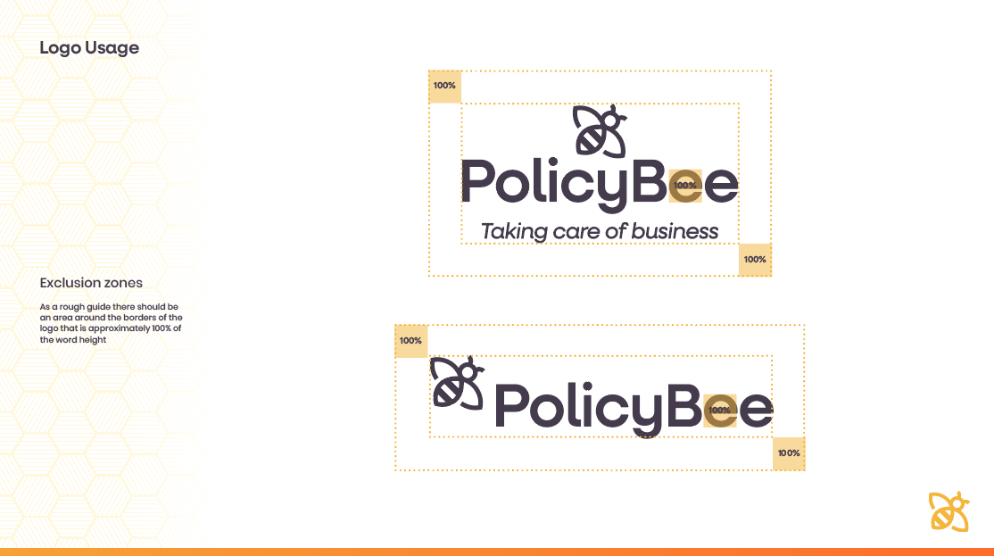
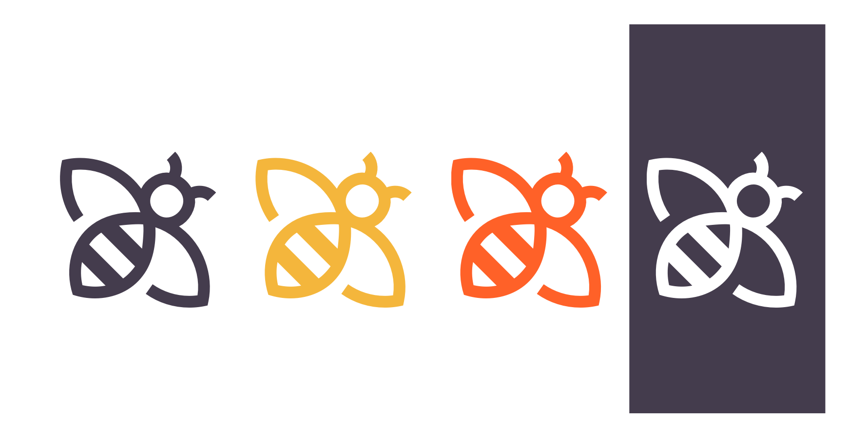
At the heart of the identity is a distinctive bee icon, reimagined with clean geometric forms and a contemporary character. The symbol represents expertise, hard work and protection, while reinforcing the brand’s role in helping small businesses thrive.
Deliverables
• Brand Design
• Asset Design
• Site Design

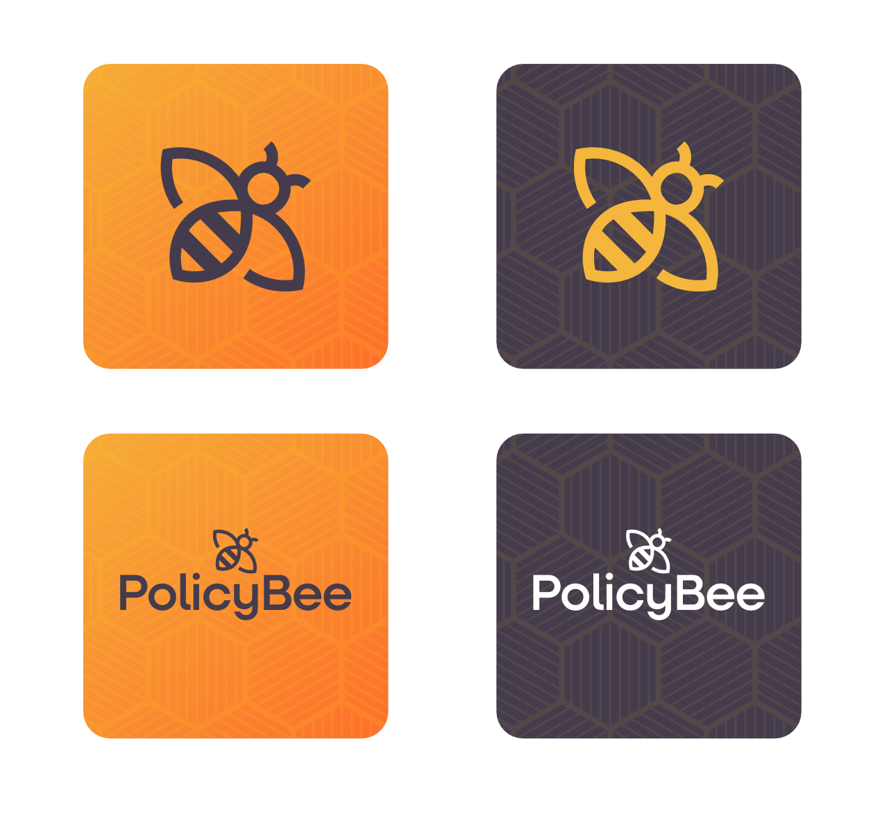
The wider visual system takes inspiration from the structure of a beehive. A custom hexagonal pattern provides a flexible framework that can be scaled across digital platforms, marketing campaigns and environmental applications. This creates a recognisable visual language that balances order, consistency and energy.